
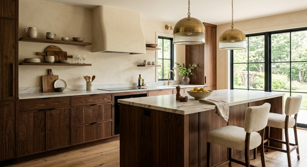
For over a decade, the “Sanitized Modern” aesthetic held a titanium grip on the world of high-end interiors. We saw it in every luxury listing from Greenwich to the Gold Coast: stark white oak floors, clinical marble countertops, and walls so bright they required sunglasses at noon. It was a design language rooted in a specific kind of perfection—one that was airy, clean, and ultimately, a little bit cold.
But as we cross the threshold of May 2026, a profound shift is occurring in the collective consciousness of homeowners, builders, and designers alike. The “all-white” era is receding, replaced by a movement that critics are calling Modern Heritage. At the heart of this revolution is a color and material pairing that feels both daringly new and comfortingly ancient: The Richness of Walnut and the Depth of Antique Cream.
This isn’t just a change in palette; it’s a return to the soul of the home. It is a rejection of the “disposable” look in favor of materials that carry weight, history, and a sense of permanence.
The Psychology of the “New Neutral”
Why now? To understand the surge in walnut and cream, we have to look at the psychology of the modern inhabitant. After years of global volatility, the home is no longer just a place to sleep—it has become a sanctuary, a private gallery, and a high-performance wellness center.
The problem with the previous decade’s obsession with “Cool Gray” and “Brilliant White” was its lack of emotional resonance. These colors are scientifically “flighty”—they reflect light in a way that can heighten anxiety and feel ungrounded.
Antique Cream (often referred to today as “Oat,” “Bone,” or “Warm Plaster”) offers a lower Light Reflectance Value (LRV) than pure white. It doesn’t just bounce light; it holds it. When applied to a wall with a subtle texture—like a Roman clay or a fine limewash—cream creates a soft, diffused glow that eliminates harsh shadows. It provides a canvas that feels living rather than static.
When you pair this “breathing” wall with Walnut, you introduce the “Grounding Effect.” Walnut is a heavy, dense wood with a low LRV. It acts as a visual anchor. In a room wrapped in cream, a walnut island or a set of hand-turned timbers provides a point of gravity. It tells the eye where to rest. This balance of “Light and Weight” is the fundamental pillar of the Modern Heritage style.
The Return of Walnut: A Legacy Reclaimed
Walnut has always been the “Royal Wood.” From the late 17th century through the Queen Anne period, it was the most highly prized material in the world for fine furniture, second only to rare imports. However, in the 2010s, it fell out of favor for lighter, “scandi-chic” woods like white oak and ash.
In 2026, walnut is making a massive comeback for three specific reasons:
-
Complexity of Grain: Unlike the relatively uniform grain of oak, walnut offers a “cathedral” pattern—a flowing, irregular movement that mimics the organic chaos of nature. In an age of AI-generated perfection, we are seeing a massive surge in demand for materials that look “perfectly imperfect.”
-
The “Latte Decorating” Trend: The design world has embraced a palette inspired by the rich, oily depths of a well-poured espresso mixed with foamed milk. Walnut provides that dark, chocolatey base that makes cream-colored upholstery look exponentially more expensive.
-
Durability and Value: As a building material, walnut is incredibly stable. For the developer, it offers a “Highest and Best Use” (HBU) value proposition. A kitchen outfitted in walnut cabinetry isn’t just a trend; it’s a legacy installation that will age into a beautiful patina rather than looking “dated” in five years.
Modern Heritage: The Architecture of Memory
The Modern Heritage movement—coined by visionary designers like the Brownstone Boys—is about bridging the gap between historical architectural elements and contemporary lifestyles. It’s about taking a 19th-century shell and filling it with 21st-century precision.
On the streets of Connecticut, we see this play out in the renovation of historic triplexes and the construction of new “BIOS” villages. Builders are no longer ripping out original moldings; they are staining them in deep walnut and pairing them with sleek, cream-colored modular components.
This style relies on “Tension Design.” By pairing a sharp, linear walnut bookshelf against a soft, curved cream-colored sofa, you create a visual dialogue. The room feels like it has been collected over decades rather than bought in a single afternoon from a showroom.
Breaking the Rules: How to Mix Wood Tones in 2026
One of the biggest fears homeowners have is: “If I go with walnut, do I have to get rid of my oak floors?”
The answer in 2026 is a resounding no. In fact, matching all your woods is now considered a design “faux pas.” Today’s most sophisticated homes are masterclasses in layering. The rule of thumb for this year is the “Two-Tone Rule”:
-
The Anchor: Use walnut for your “eye-level” pieces—kitchen cabinets, dining tables, or mantels. These are the pieces that define the room’s character.
-
The Foundation: Keep your flooring two to three shades lighter (like a warm, honeyed oak). This prevents the room from feeling like a “dark box” and allows the walnut pieces to “pop” against the floor.
-
The Bridge: Use cream textiles—a heavy bouclé rug or unbleached linen curtains—to act as the mediator between the two different wood tones.
The Wellness Connection: Sensory Design
At Home & Art Magazine, we have always championed the idea that architecture is a form of medicine. The move to walnut and cream is, at its core, a move toward Wellness Design.
Research into biophilia—our innate human connection to nature—shows that looking at complex wood grains can lower cortisol levels. Similarly, “Antique Cream” palettes are easier on the eyes in our screen-heavy world.
We are seeing a rise in “Sensory Rooms”—spaces designed for meditation or “unplugging”—where walnut slats are used on the ceiling for acoustic dampening, and the walls are finished in a creamy, tactile plaster that begs to be touched. This is design you can feel.
The Developer’s Perspective: HBU and Market Appeal
For the developers and real estate pros reading this, the shift to walnut and cream isn’t just an aesthetic choice—it’s a financial one. Data from the first quarter of 2026 shows that “Warm Contemporary” homes (those utilizing wood and warm neutrals) are selling 15% faster than “Cold Modern” homes.
High-net-worth buyers are looking for “Quiet Luxury.” They want homes that feel substantial. Walnut cabinetry communicates quality in a way that painted MDF simply cannot. By investing in these high-quality natural materials, developers are creating “right-sized” luxury—where the focus is on the quality of the square footage rather than the quantity.
Final Thoughts: A New Chapter for the American Home
As we look at the center-feed of our magazine today, we see a common thread. Whether it’s a modular factory proposal for a new multifamily project or a boutique art gallery in Thomaston, the “Sterile White” box is being filled with warmth.
The pairing of Walnut and Cream is a signal that we are ready for a more mature, thoughtful era of design. We are moving away from the “Instagrammable” home that looks good in a photo but feels hollow in person. We are moving toward homes that embrace history, honor craftsmanship, and—above all—provide a warm, grounded place to live.
In the coming weeks, Home & Art Magazine will be featuring three Connecticut homes that perfectly embody this “Modern Heritage” spirit. We will look at how a 1920s colonial was brought into the future using nothing but walnut, cream, and a lot of imagination.
Stay tuned, and remember: The most beautiful thing you can put in a home is its soul.
Key Takeaways for the Reader:
-
Color Tip: Look for creams with orange or beige undertones rather than yellow to avoid a “dated” look.
-
Material Tip: When choosing walnut, look for “live edge” or “cathedral grain” to maximize the biophilic benefits.
-
Hardware Tip: Pair walnut and cream with Satin Champagne or Brushed Nickel for a 2026 finish.
