
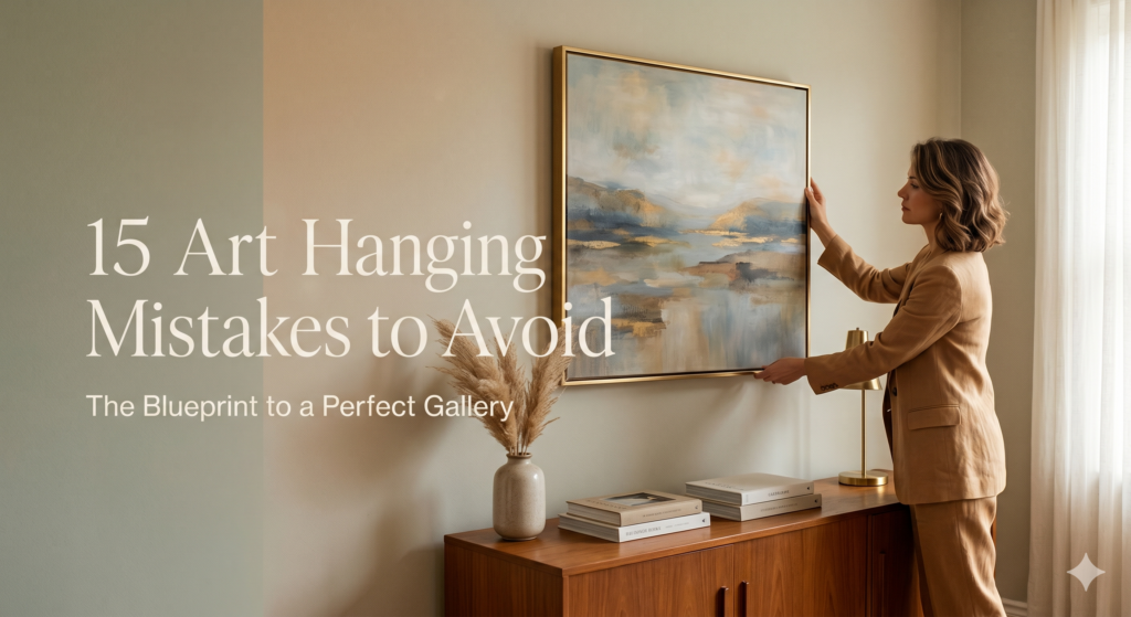
We’ve all been there. You find the perfect painting, print, or photograph. You bring it home, excited to transform your space. You grab a hammer, drive a nail into the wall, step back, and… something feels entirely off.
Decorating a blank wall shouldn’t feel like a high-stakes game of trial and error. Yet, walk into almost any home, and you’ll spot the same subtle design missteps that instantly make a room feel smaller, cluttered, or disjointed. Interior design isn’t about luck; it’s about math, scale, and visual weight.
To help you turn your home into a expertly curated gallery, we’ve rounded up the 15 most common art-hanging mistakes people make—and the foolproof design secrets to fix them instantly.
1. The “Too High” Epidemic
The single most common mistake in interior design is hanging artwork too close to the ceiling. This disconnects the art from the room and forces people to strain their necks.
-
The Fix: Use the museum standard 57-inch rule. The center of your artwork (not the top of the frame) should sit exactly 57 to 60 inches from the floor, mimicking human eye level.
[IMAGE 1: The 57-Inch Rule Infographic] (Blueprint graphic showing a dashed line 57 inches from the floor passing through the exact center of a frame.)

2. Floating Art Over Furniture
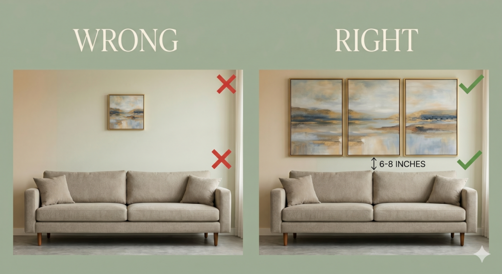
Hanging a piece of art too high above a couch, console, or bed breaks the visual relationship between the furniture and the decor, making the art look like it’s trying to escape.
-
The Fix: Anchor the artwork by hanging the bottom of the frame just 6 to 8 inches above the top of the furniture piece.
3. Ignoring the 2/3 Scale Rule
When you hang a tiny frame over a massive three-seater sofa, the scale is completely swallowed up, making the artwork look insignificant and awkward.
-
The Fix: Ensure your artwork (or your collection of frames) spans roughly two-thirds to three-quarters of the total width of the furniture below it.
4. The “Single Nail” Tilt
Relying on a single nail or hook for a wide frame ensures your art will constantly tilt every time a door slams or someone walks past.
-
The Fix: For any frame wider than 2 feet, use two picture hooks spaced a few inches apart. This distributes the weight and keeps the piece perfectly level.
5. Blindly Guessing the Placement
Eyeballing where the nail goes based on the top of the frame, only to realize the hanging wire or bracket has a 3-inch slack, leading to a wall full of accidental “swiss cheese” holes.
-
The Fix: Turn the frame around, pull the hanging wire taut toward the top, and measure the distance from the wire to the top of the frame. Subtract that distance from your wall mark before hammering.
6. The Chaotic Gallery Wall
Arranging a gallery wall without a plan usually results in a chaotic, messy puzzle that feels incredibly stressful to look at.
-
The Fix: Map out your gallery wall on the floor first. Once you like the arrangement, trace the frames onto butcher paper, tape the paper layouts to the wall, and hammer directly through the paper.
7. Inconsistent Spacing
Spacing frames 5 inches apart on one side of a gallery wall and 1 inch apart on the other disrupts the visual rhythm and look sloppy.
-
The Fix: Consistency is key. Keep a strict 2-to-3-inch gap between every single frame in a cluster, regardless of the frame sizes.
[IMAGE 2: Gallery Wall Grid Layout] (A split graphic displaying “Wrong: Random spacing” vs “Right: Clean, uniform 2-inch spacing grid”.)

8. Choosing the Wrong Glass
Hanging a moody, dark photograph directly opposite a bright window with standard glass results in nothing but a blinding glare.
-
The Fix: For high-light areas, invest in anti-reflective or museum-grade glass so you can actually see the art from any angle in the room.
9. Underestimating White Space
Crowding a small wall with massive, edge-to-edge art can make a room feel incredibly claustrophobic and cramped.
-
The Fix: Let your walls breathe. Leave plenty of negative white space around solitary pieces of art to give them a premium, intentional presence.
10. The Tiny Mat Mistake
Using tiny, narrow frames with equally narrow matting can make beautiful art look cheap and commercially mass-produced.
-
The Fix: Go oversized. A small 4×6 print inside an oversized 11×14 frame with a wide, dramatic white mat instantly looks custom, high-end, and artistic.
11. Overcomplicating the Hardware
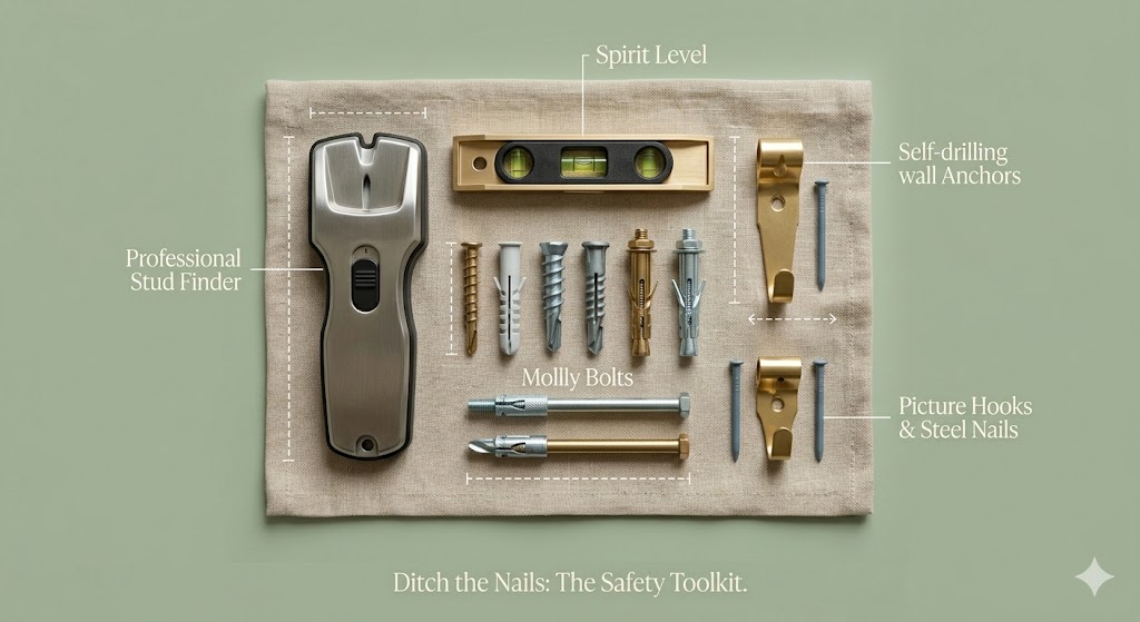
Using flimsy finishing nails for heavy wood frames, or conversely, drilling massive anchor screws for a feather-light canvas.
-
The Fix: Match the hardware to the weight. Use simple brass picture hooks for up to 20 lbs, and toggle bolts or drywall anchors for anything heavier.
12. Matching the Art to the Couch Too Perfectly
Buying a painting solely because it perfectly matches the exact shade of teal on your throw pillows can make a home feel sterile, corporate, and devoid of personality.
-
The Fix: Decorate with contrast. Art should complement the room’s mood, but it doesn’t need to match the fabric perfectly. Look for complementary undertones instead.
13. Neglecting Grid Alignment
When hanging a Triptych (a set of three matching prints) or a grid, even a quarter-inch misalignment looks glaringly obvious and ruined.
-
The Fix: Use a laser level or painter’s tape to create a perfectly straight horizontal baseline across the wall before marking your hook placements.
14. Hanging Only One “Style” of Art
Displaying exclusively flat, framed canvas prints throughout an entire house can make the walls feel two-dimensional and flat.
-
The Fix: Mix your mediums. Blend framed photography with textured canvases, floating text-art, shadows boxes, or even three-dimensional ceramic wall sculptures to create depth.
15. Forgetting the Lighting
Even a perfectly hung, million-dollar masterpiece will look dull and lifeless if it sits in a dark, unlit corner of the room.
-
The Fix: Bring your art to life by installing a wireless, rechargeable LED picture light above the frame, or angling a nearby track-light spotlight directly toward the piece.
Summary: The Golden Rules of Wall Curation
Here is your polished final section with the link seamlessly integrated into the text to keep it looking natural, professional, and high-end:
Hanging art flawlessly doesn’t require a degree in interior design—it just requires a shift from guessing to measuring. If you can remember to keep the center of your art at 57 inches, maintain a 6-to-8-inch gap above furniture, and give your frames a consistent 2 inches of breathing room, you will instantly elevate the entire look of your home.
The next time you pick up a hammer, leave the guesswork behind. Treat your home like the gallery it deserves to be, protect your drywall from unnecessary holes, and let your art take center stage. For more expert styling guides, artist features, and curated decor inspiration, explore the latest masterclasses over at Home & Art Magazine.
Room-by-Room Art Styling FAQ
How do you choose the right art size for a large living room wall?
When dealing with massive living room walls, scale is everything. A common mistake is selecting a piece that is too small, which makes the entire room feel unanchored. Ideally, your artwork should cover 60% to 75% of the available wall space that isn’t already blocked by furniture or architectural features. If you fall in love with a smaller print, don’t hang it solo; instead, frame it with an oversized mat or group it with complementary pieces to create a larger visual footprint.
What is the best height to hang art in a hallway or entryway?
Hallways and entryways are unique because people are almost always standing when they view the art, rather than sitting on a sofa. For transitional spaces, stick strictly to the upper limit of the museum standard: 60 inches from the floor to the center of the image. If you are creating a gallery wall down a long hallway, keep the center line perfectly uniform across all pieces to create a fluid, rhythmic sightline that draws guests into the home.
How do you safely hang heavy artwork without drilling into studs?
You do not always need a wooden wall stud to secure heavy frames, but you must ditch standard nails. For drywall or plaster, rely on threaded drywall anchors (which screw directly into the wall and spread out behind it) or toggle bolts for maximum weight capacity. If you are renting and cannot drill large holes, heavy-duty adhesive interlocking strips can support up to 15 pounds, provided the wall surface is clean and untextured.
Should artwork frames match the architectural style of the house?
Your frames do not need to match your architecture perfectly, but they should speak the same design language. For a modern, mid-century, or industrial home, slim black metal or raw light wood frames look exceptional. For traditional, colonial, or Parisian-style spaces, ornate gold gilt or dark walnut frames add necessary warmth and historical weight. Mix frame styles intentionally to make your collection look naturally accumulated over time rather than bought all at once.
